Websites
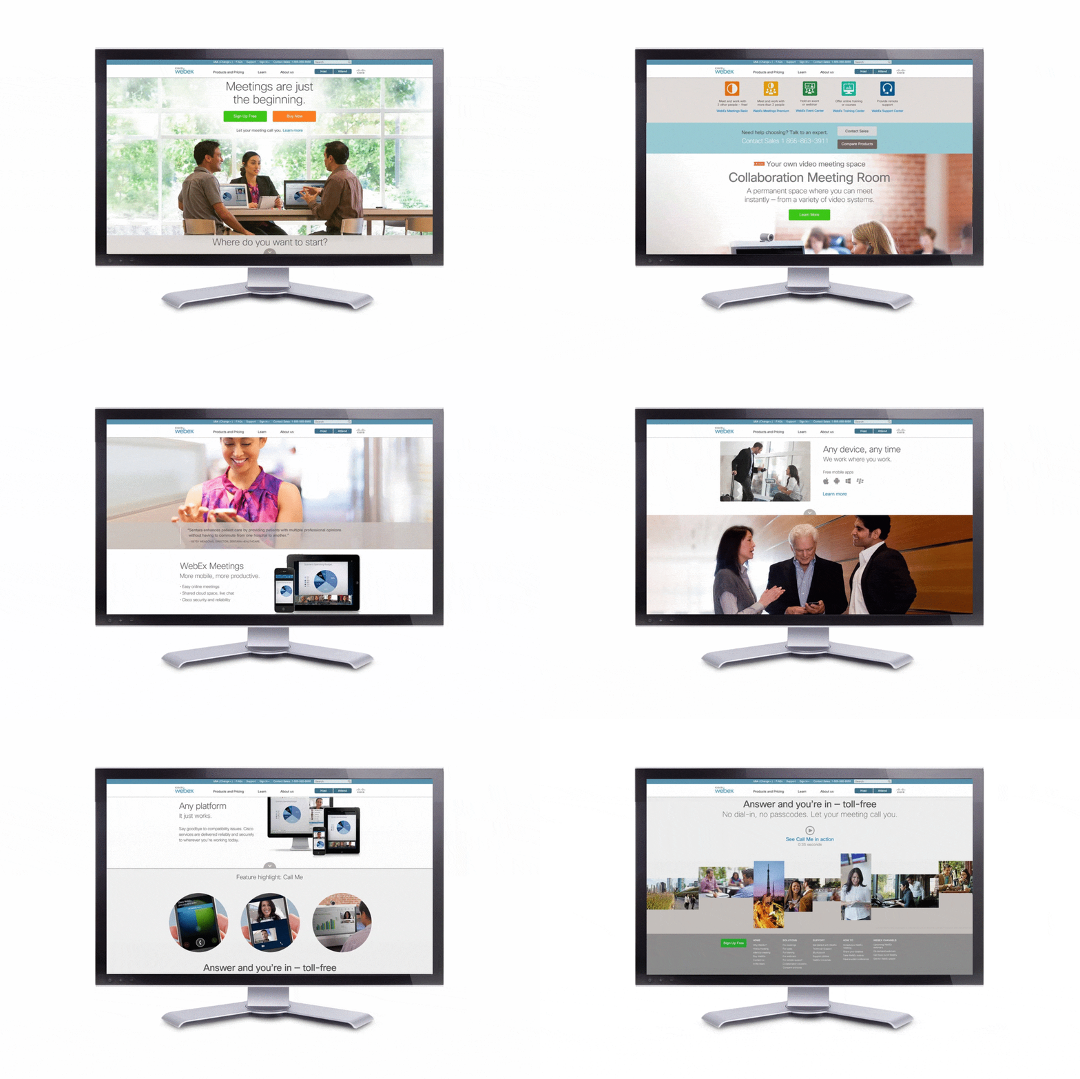
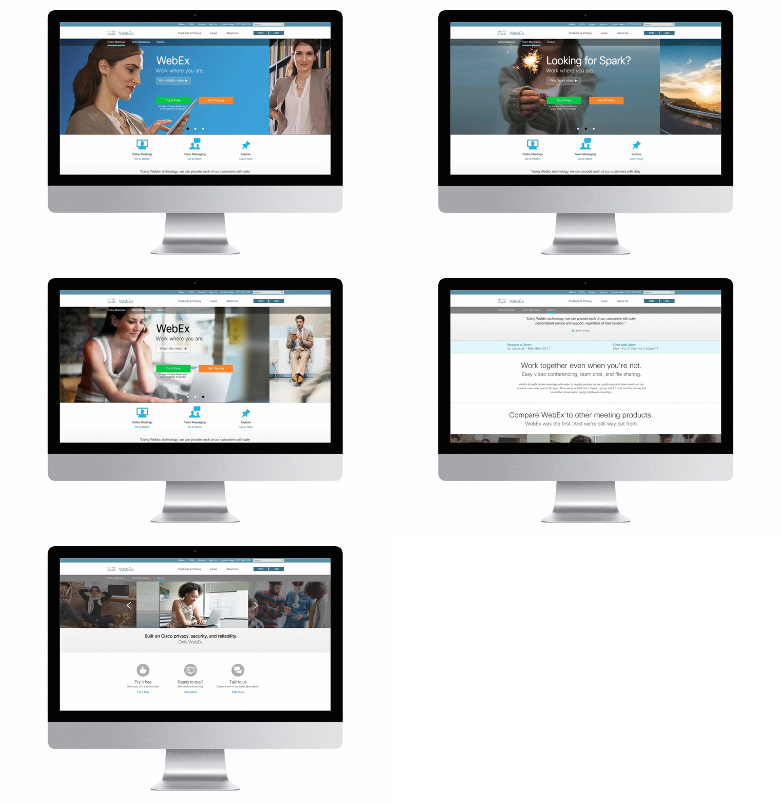
After doing multiple customer journey workshops, I developed a customer journey map for WebEx. And started a visual refresh of our SaaS website. My mobile-first direction – with CTAs to help drive leads to sales – was selected.
ROLE I was brought in to lend my expertise to the webex.com website redesign. The customer journey work informed a more open feeling website home page experience, complemented by original photography . The copy had gone through numerous iterations and once approved it was critical to make sure the design was able to accommodate it without content changes.

The task at hand
DESIGN/UX CHALLENGES Improve website performance, introduce new content with a refreshed look, with a mobile first approach. Copy had to be used with no deletions or adjustments and the grid had to be flexible to accommodate 16 language translations.
SOLUTION Original imagery showing modern, open workspaces elevated the brand and the consistent use created greater design cohesion. This was the the first responsive website for WebEx, and used a flexible 12-column grid system based on Bootstrap. The font stack used was CIsco Sans, and Helvetica. To improve readability #222, #999, and #555 were used for typography. CTAs appear in brand colors and I designed icons and introduced a new color palette. We used testimonials throughout the site to establish credibility and gave opportunities to download the free version of the product direct to mobile via SMS.
RESULTS The website saw a 6% lift in conversions and a 22% lift on mobile.

Customer Journey Map
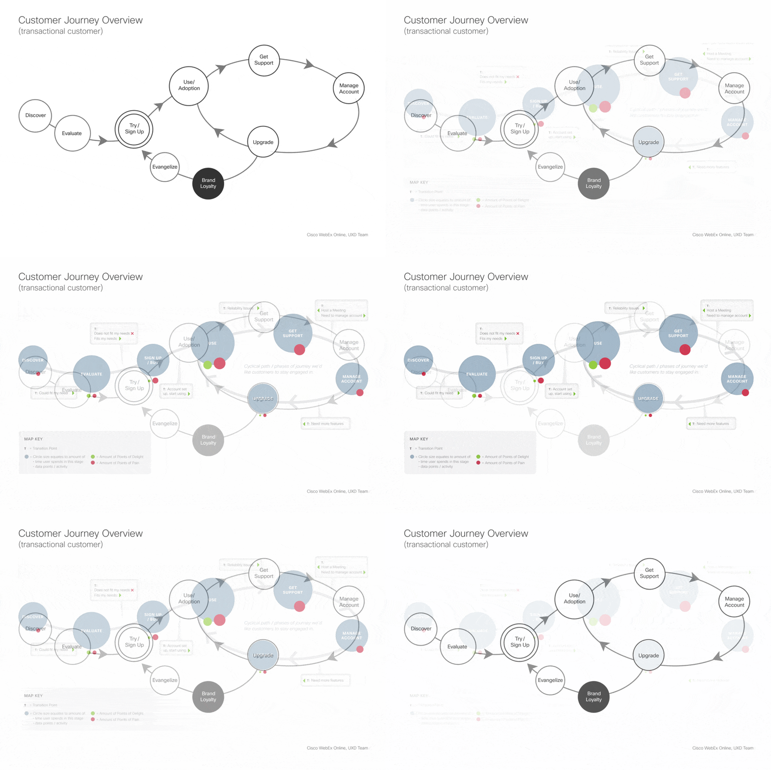
Everyone on the UX Design team did a spin on the WebEx customer journey. While there were many viable options, the designers routed the journey maps to marketing and product marketing and the consensus was unanimous. We moved forward using my sketch, with the "brand loyalty" loop pushed out for future consideration.
ROLE UX research and design.
WebEx Website Refresh 2
After the initial refresh went live, I concepted two versions of a webex.com home page with a single Cisco Spark home page. Ultimately, the decision was made to have two distinct websites.
ROLE Design and production.
DESIGN/UX CHALLENGES Designers were tasked to lead out with Cisco Spark, our new team collaboration product balancing that with WebEx and a lot of brand awareness.
SOLUTION I selected more aspirational imagery that was driven by the concept of “Possibilities” and designed to appeal to the desire for success. I used the 12-column grid Bootstrap grid and centered copy. As in previous web refreshes typography was Cisco Sans. We used cookie data with behavioral data to pull users into the section of the site that would be more relevant for them, with opportunities to explore other areas.
RESULTS Upper management decided to keep the products separate in two distinct websites and ultimately, Cisco Spark was folded up into WebEx. The decision would not have happened without actually seeing how the union might work.
Interaction
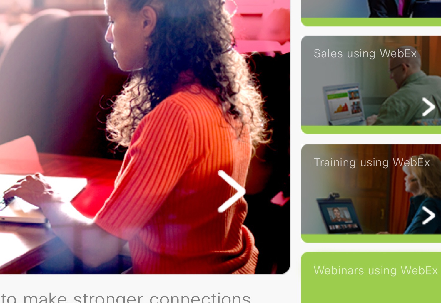
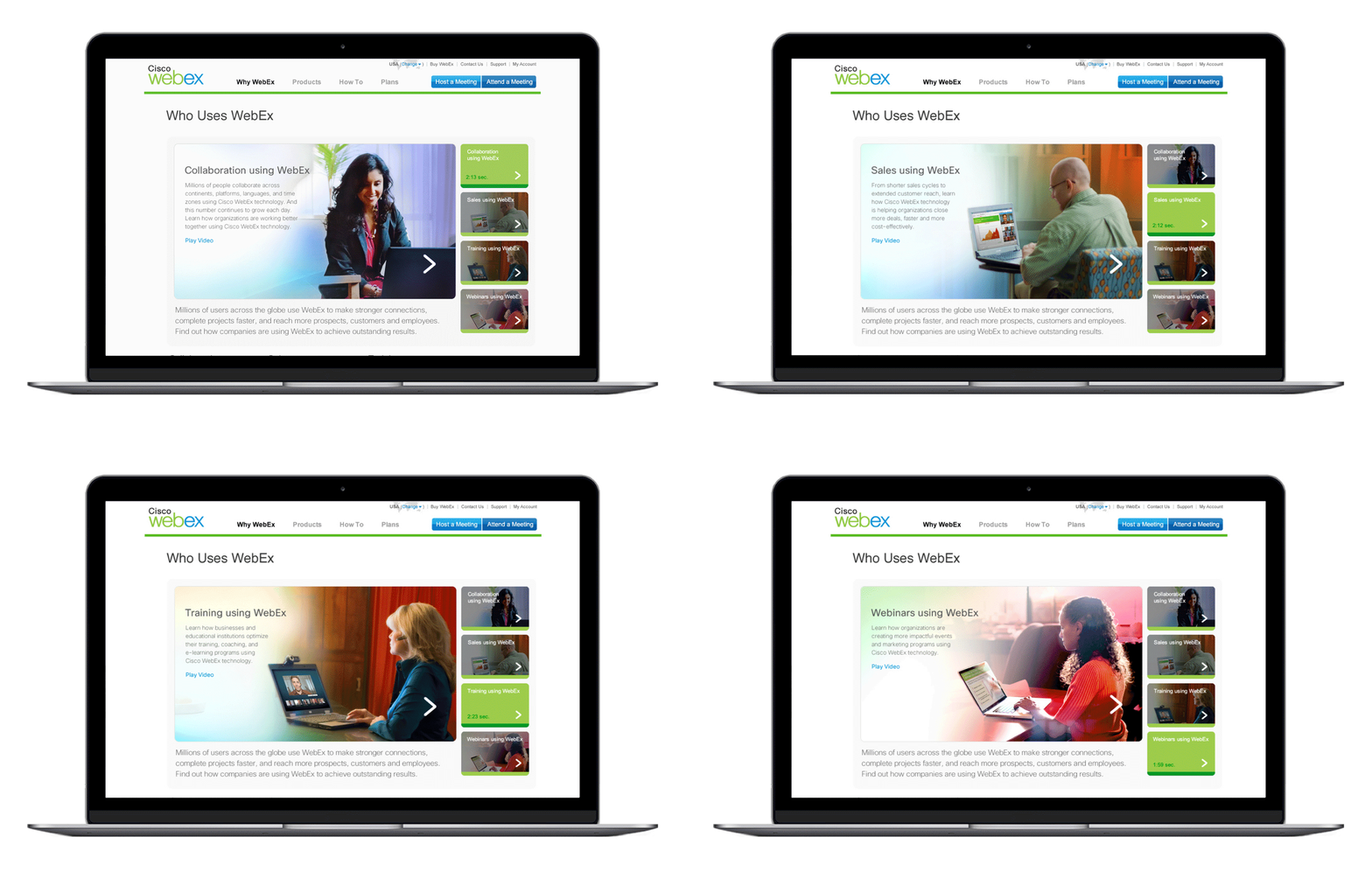
I designed the format and interaction for these WebEx How-To videos and case studies. The videos were created around four main buyer types.
ROLE Video art director and designer.
Product Pages
WebEx has several versions of the flagship product. I designed these pages for three of those products, plus the pricing page.
ROLE Photography art director and interaction design.


Start-Up: Pionetics
Pionetics makes water treatment products used to produce clean drinking water for everyone on the planet. Founded by several scientists, I designed their identity system and website.
ROLE Designer, client interface, coordination with web developer.
DESIGN/UX CHALLENGES Create a brand system and website for a small start-up to lend credibility to their mission and attract partners. The end goal was to position them well for an acquisition.
SOLUTION I developed a clean, fresh look with imagery in brisk blues and light grays. Typography was used in classic Garamond and Helvetica, supported by a three-column grid.
RESULTS They were successfully acquired by Rayne Corporation to continue their vision, one drop at a time.


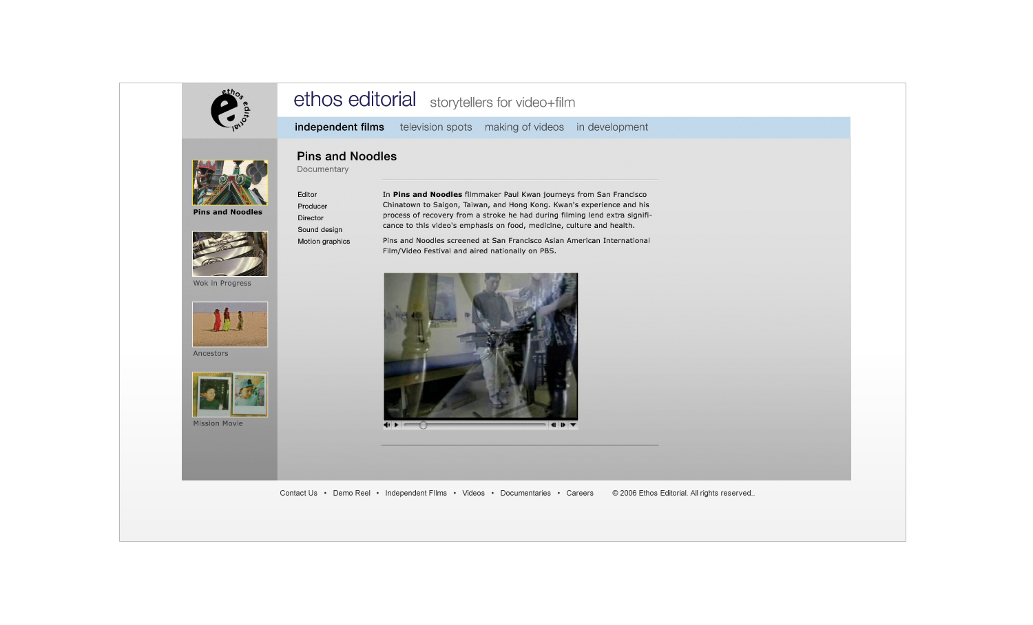
Start-Up: Ethos Editorial
A full-service creative studio, their ethos is to make the best possible videos for their clients.
ROLE Designer and client interface.
DESIGN/UX CHALLENGES Create a website to showcase their award-winning work in short videos and documentaries.
SOLUTION I created a tight grid system and modular design to let the clients update and change the site as needed.
RESULTS They were hired as the internal video group for a top client.

